The Role of Color Psychology in Marketing and Branding
I. Introduction to Color Psychology in Marketing and Branding
– Sparsh Gandhi
A. Definition of Color Psychology
Color psychology is a concept that studies how a certain color imparts human activities and emotional feelings. Marketing takes advantage of this concept to change perceptions, create emotions, and make the consumer behave in a certain way. Different colors can be associated with an idea or feelings attached to it; therefore, they become excellent vehicles in branding. Colors are used strategically by brands to send specific messages, establish identity, and add atmosphere for the consumer.
B. The importance of color psychology in branding:
Colour is particularly essential in branding because it affects consumer perception of a brand immediately. The appropriate colors evoke the right emotions for the brand, hence it may be emotional, it could be the presentation of the brand as developed by the designers. Its contribution was to recognition of the brand, the emotional way to reach the customer, and to influence the purchase decisions. For example, the flashy and invigorating colours like red or orange can give excitement and velocity while the relaxing colors, such as blue or green, produce trust and relaxation.
C. Color and Marketing History
Colors have for long been used to signify, and as such, had an effect on art, religions, and the way communication takes place. Over the past century, with the emergence of branding and advertising, marketers have employed colors in intentional ways toward the expression of brand identity. Brands like Coca-Cola with its trademark red to signify excitement, Tiffany & Co. with blue, have signaled attempts to use color to permit a level of instant recognition. Today, Brands within any sector employ color psychology as part of their very comprehensive marketing strategies.
II. Color Psychology in Branding Elements
Understanding Your Audience’s Emotional Triggers
To apply color meaningfully to branding, it is important to understand the emotional triggers of the target audience. Demographics and cultures can react differently to colors. While white connotes purity in the West, it indicates mourning in some of the Eastern cultures. Therefore, knowing what your audience psychologically or culturally associates with color means that your branding will echo across the globe.
A. Using Colors that Reflect Brand Identity and Values
Colors should symbolize what a brand is supposed to be. For example, the financial services market associates with reliability and stability because of the color blue, and for an eco-friendly brand, greens are the colors that mirror nature and sustainability. Such colors help companies connect their brand mission with identity in the minds of a consumer.
B. Choosing a Harmonious and Balanced Choice of Color
A cohesive color palette balances and contrasts for visual cohesion. Overuse of colors in conflict will overwhelm the consumer, whereas a cohesive palette strengthens brand recall. Brands usually lead their identity with a primary colour and use secondary or accent colors to add depth and dimensionality. A well-planned palette helps guide the customer through a pleasant visual experience and has a consistent vision across all marketing channels.
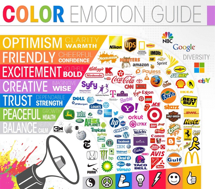
III. Colours in Branding
![]()
A. Red: Energy, Urgency, and Passion
Red color is strong, attention-seeking, and carries passion and energy. It is almost coloratively used when urgency is to be sensed; therefore it can be seen in clearance sales, fast-food branding. In the use of red, companies such as Coca-Cola and Target aim at “energy, action, and urgency-ness” to engage their consumers.
B. Blue: Trust, Stability, and Calm
Blue is perhaps the most popular color around corporate branding logos as it is said to evoke one’s sense of trust, stability, and calmness. Financial organizations like Chase or PayPal use blue in their logos because it carries one’s perception toward security and professionalism. A good brand that targets dependability and trustworthiness would prefer a color that evokes those feelings, which makes blue a great choice.
C. Green: Health, Nature, and Sustainability
Green has been a word often associated with nature, health, and sustainability. Thus, most brands that are focused on either or both aspects of environmental consciousness or well-being use green. Examples of such brands include whole foods and body shop, both of which used green mainly as an indicator of being both eco-friendly and healthy.
D. Yellow: Optimism, Warmth, and Clarity
Yellow is a color of happiness, optimism, and warmth. McDonald’s and Ikea are brand names using yellow in every promotion to make the consumer feel welcome and jolly about buying their products. A little yellow does an enormous thing as a highlight, and too much of it seems to give one anxiety or irritability.
E. Black and White: Sophistication and Simplicity
Black is classy and powerful, therefore one of the most popular choices when talking about luxury brands like Chanel or Louis Vuitton. White is symbolic of simplicity and purity and is probably used by those who are more minimalist and straightforward about their intentions, like Apple. Put together, they become something amazingly classic that can’t be ascribed to any fad.